


Note
Go to the end to download the full example code.
Use N-dimensional Histogram functionality and Interpolation#
could be used for example to read and interpolate an lookup table or IRF.
In this example, we load a sample energy reconstruction lookup-table from a FITS file
In this case it is only in 2D cube (to keep the file size small):
SIZEvsIMPACT-DISTANCE, however the same method will work for any dimensionality
15 import matplotlib.pylab as plt
16 import numpy as np
17 from astropy.io import fits
18 from scipy.interpolate import RegularGridInterpolator
19
20 from ctapipe.utils import Histogram
21 from ctapipe.utils.datasets import get_dataset_path
22
23 # %matplotlib inline
load an example datacube#
(an energy table generated for a small subset of HESS simulations) to
use as a lookup table. Here we will use the Histogram class, which
automatically loads both the data cube and creates arrays for the
coordinates of each axis.
36 testfile = get_dataset_path("hess_ct001_energylut.fits.gz")
37 energy_hdu = fits.open(testfile)["MEAN"]
38 energy_table = Histogram.from_fits(energy_hdu)
39 print(energy_table)
Downloading hess_ct001_energylut.fits.gz:   0%|          | 0.00/29.9k [00:00<?, ?B/s]
Downloading hess_ct001_energylut.fits.gz:  34%|███▍      | 10.2k/29.9k [00:00<00:00, 84.6kB/s]
Downloading hess_ct001_energylut.fits.gz: 100%|██████████| 29.9k/29.9k [00:00<00:00, 241kB/s]
Histogram(name='Histogram', axes=['LSIZ' 'DIST'], nbins=[100 100], ranges=[[5.e-01 6.e+00]
 [0.e+00 2.e+03]])
construct an interpolator that we can use to get values at any point:#
Here we will use a RegularGridInterpolator, since it is the most
appropriate for this type of data, but others are available (see the
SciPy documentation)
51 centers = [energy_table.bin_centers(ii) for ii in range(energy_table.ndims)]
52 energy_lookup = RegularGridInterpolator(
53     centers, energy_table.hist, bounds_error=False, fill_value=-100
54 )
energy_lookup is now just a continuous function of log(SIZE),
DISTANCE in m.
Now plot some curves from the interpolator.#
Note that the LUT we used is does not have very high statistics, so the interpolation starts to be affected by noise at the high end. In a real case, we would want to use a table that has been sanitized (smoothed and extrapolated)
70 lsize = np.linspace(1.5, 5.0, 100)
71 dists = np.linspace(50, 100, 5)
72
73 plt.figure()
74 plt.title("Variation of energy with size and impact distance")
75 plt.xlabel("SIZE (P.E.)")
76 plt.ylabel("ENERGY (TeV)")
77
78 for dist in dists:
79     plt.plot(
80         10**lsize,
81         10 ** energy_lookup((lsize, dist)),
82         "+-",
83         label="DIST={:.1f} m".format(dist),
84     )
85
86 plt.legend(loc="best")
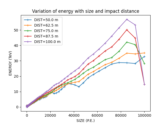
<matplotlib.legend.Legend object at 0x73f04f84c560>
Using the interpolator, reinterpolate the lookup table onto an \(N \times N\) grid (regardless of its original dimensions):
 94 N = 300
 95 xmin, xmax = energy_table.bin_centers(0)[0], energy_table.bin_centers(0)[-1]
 96 ymin, ymax = energy_table.bin_centers(1)[0], energy_table.bin_centers(1)[-1]
 97 xx, yy = np.linspace(xmin, xmax, N), np.linspace(ymin, ymax, N)
 98 X, Y = np.meshgrid(xx, yy)
 99 points = list(zip(X.ravel(), Y.ravel()))
100 E = energy_lookup(points).reshape((N, N))
Now, let’s plot the original table and the new one (E). The color bar shows \(\log_{10}(E)\) in TeV
108 fig, axs = plt.subplots(1, 2, figsize=(12, 5), layout="constrained")
109 axs = axs.ravel()
110
111 # the uninterpolated table
112 im = axs[0].pcolormesh(
113     energy_table.bin_centers(0),
114     energy_table.bin_centers(1),
115     energy_table.hist.T,
116     cmap="inferno",
117 )
118 axs[0].set_title(f"Raw table, uninterpolated {energy_table.hist.T.shape}")
119 cb = fig.colorbar(im, ax=axs[0])
120 cb.set_label(r"$\log_{10}(E/\mathrm{TeV})$")
121
122 # the interpolated table
123 im = axs[1].pcolormesh(
124     np.linspace(xmin, xmax, N),
125     np.linspace(ymin, ymax, N),
126     E,
127     cmap="inferno",
128 )
129 axs[1].set_title(f"Interpolated to a ({N}, {N}) grid")
130 cb = fig.colorbar(im, ax=axs[1])
131 cb.set_label(r"$\log_{10}(E/\mathrm{TeV})$")
132
133 for ax in axs:
134     ax.set(
135         xlim=[1.5, 5],
136         ylim=[0, 500],
137         xlabel=r"$\log_{10}(\mathrm{SIZE})$",
138         ylabel="Impact Dist / m",
139     )
140
141 plt.show()
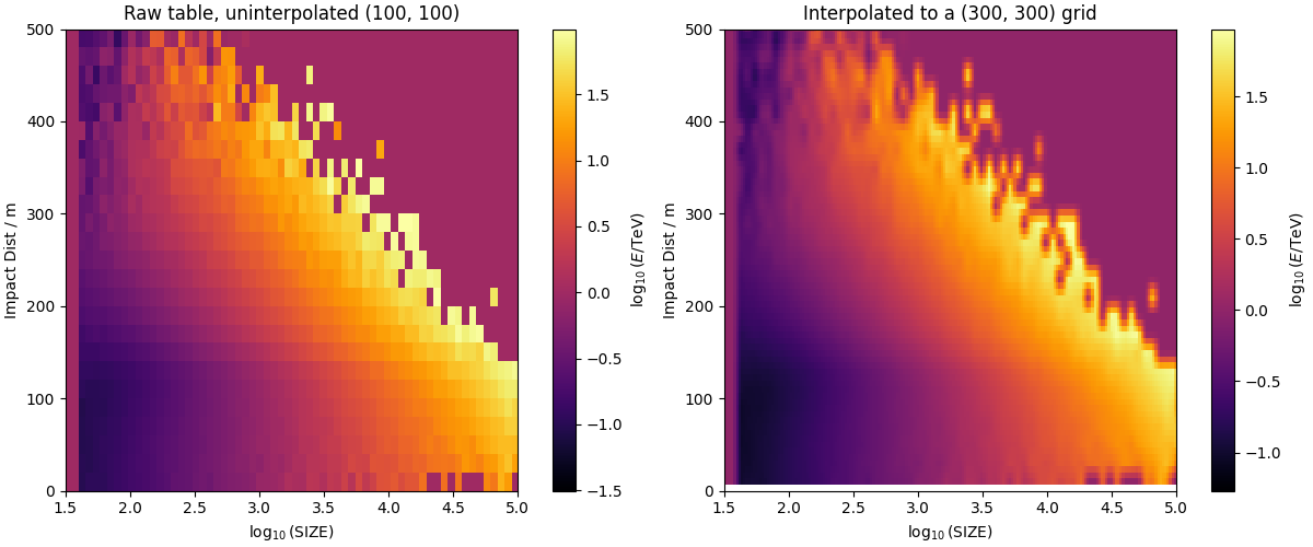
In the high-stats central region, we get a nice smooth interpolation function. Of course we can see that there are a few more steps to take before using this table: * - need to deal with cases where the table had low stats near the edges (smooth or extrapolate, or set bounds) - may need to smooth the table even where there are sufficient stats, to avoid wiggles
Total running time of the script: (0 minutes 1.014 seconds)